
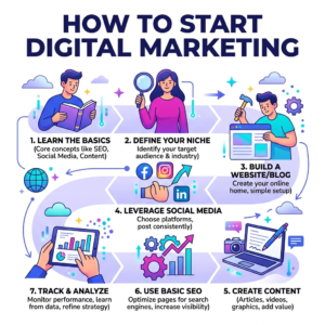
How to Start a Digital Marketing Business ?
Starting a digital marketing business can be a great opportunity...
Read More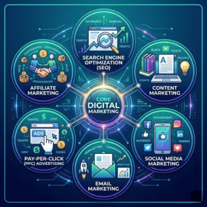
The Six Core Types of Digital Marketing
Search Engine Optimization Pay-Per-Click Advertising Pay-Per-Click (PPC) Advertising is a...
Read More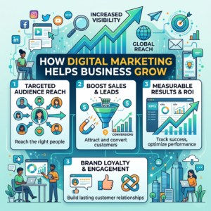
How Digital Marketing Helps Businesses Grow ?
Growing a business with digital marketing means using online platforms...
Read More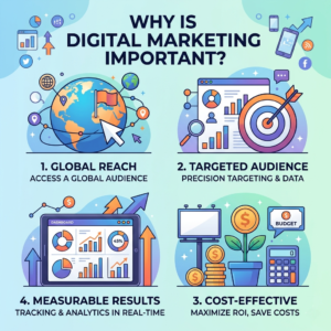
Why Is Digital Marketing Important?
Digital marketing is important because it helps businesses promote their...
Read More